Notes ·
The exit is the confirmation
A weekend experiment with one rule: every animation has to make the action land harder, or it goes. Nothing here shipped to a client.
In 2017 Tobias Ahlin wrote about action-driven animation: instead of animating a state change (open, closed), you animate the action that caused it, so the same panel leaves differently depending on whether you sent, saved or discarded. I had read it years ago and agreed with it. Agreeing is cheap. I wanted to feel where the idea breaks when you build it.
So I picked a surface I use all day: the composer of an AI coding agent, the box you type into in Claude Code or Codex. It has four real actions. Send. Queue a message for after the current turn. Stash a draft. Stop the agent. My question was whether the exit animation alone could tell you which one you just did, before you read a single label.
The rule that made every other decision
The composer never moves. Only the thing that goes somewhere moves, and it lands exactly where it will live from then on. That one sentence killed most of the first draft.
Version one animated the whole composer card out of view on every action. It looked like the essay demo, and it lied: the card was not going anywhere, the message was. Once I made the text itself the thing that travels, the four exits stopped being four flavours of the same slide and became four different sentences.
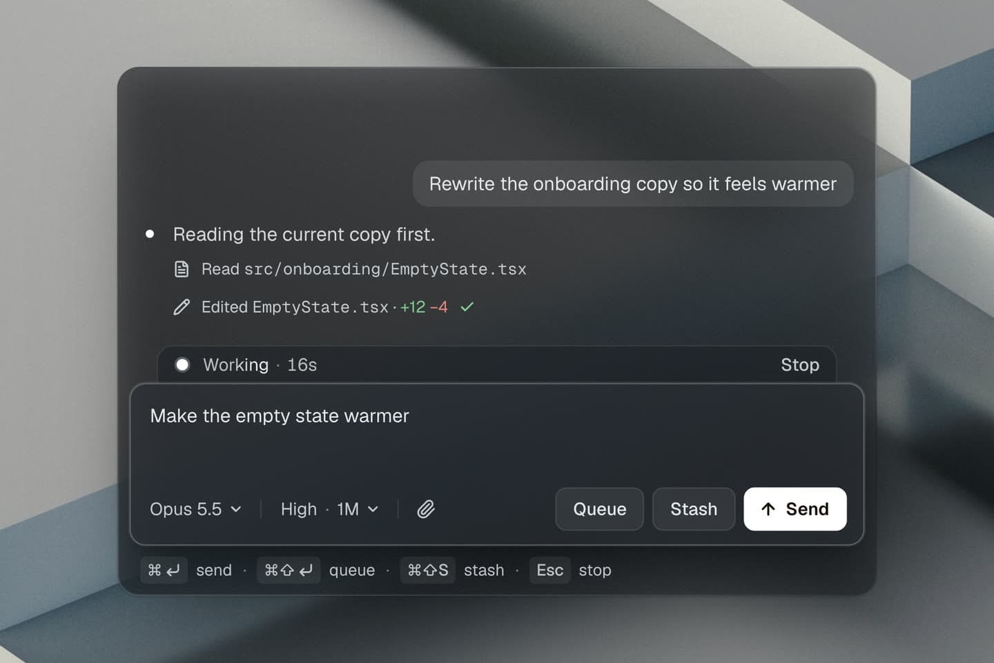
Send: the text becomes the bubble
The message lifts out of the textarea and travels up into the transcript. It does not fade and get replaced by a bubble. It is the bubble: the same glyphs, the same 14px, and the bubble’s fill grows around them on the way up. In the last frame the flying text and the real bubble swap in a single React commit, so no frame ever shows both or neither.
That handover took more time than every curve in the project combined. Getting the text to land within a pixel of where the bubble lays it out means measuring the destination before the message leaves, with a hidden probe row that reserves the slot. The curve is an accelerating ease-in, which every motion guide tells you not to use on UI. Here it is the point: sending is a launch, and it is capped at 260ms so the slow start never reads as lag.
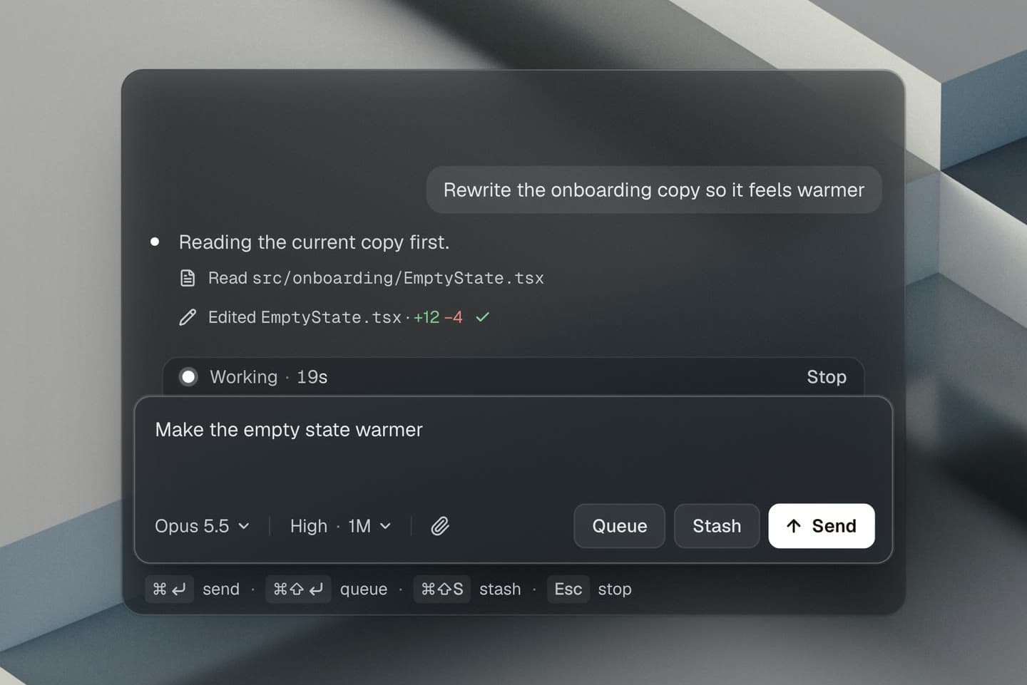
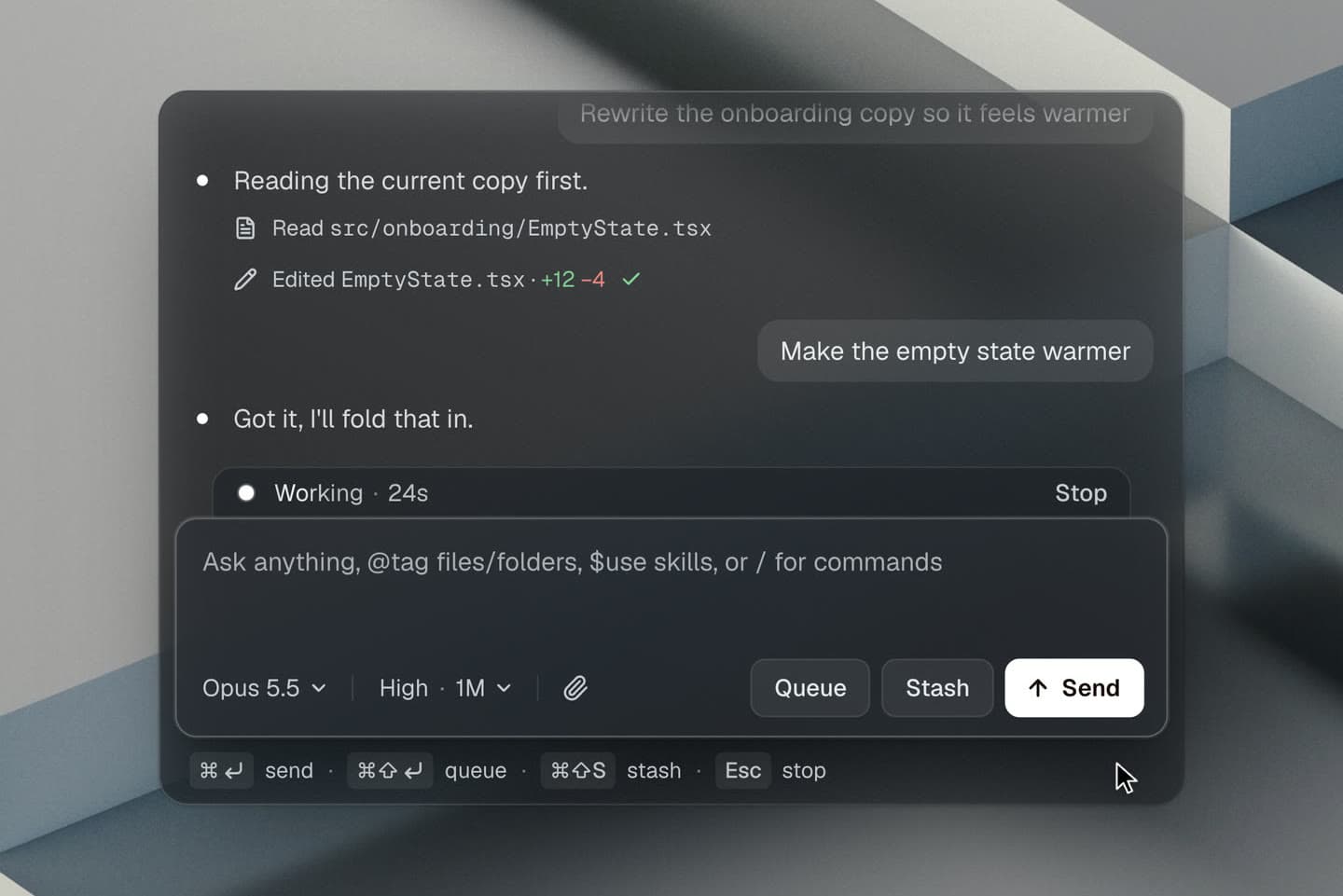
Queue: it waits its turn, right above you
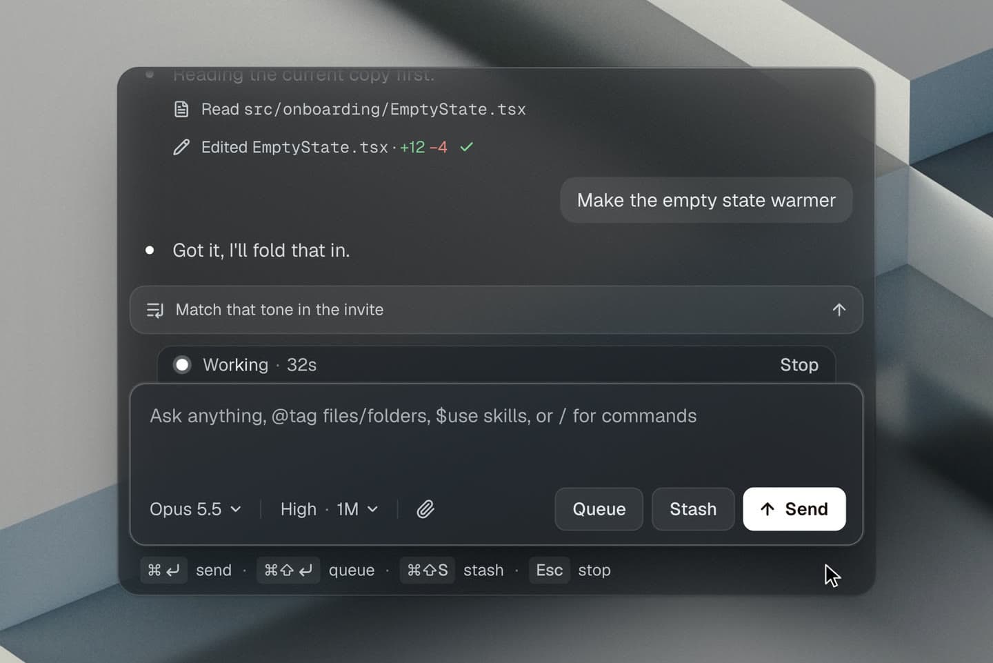
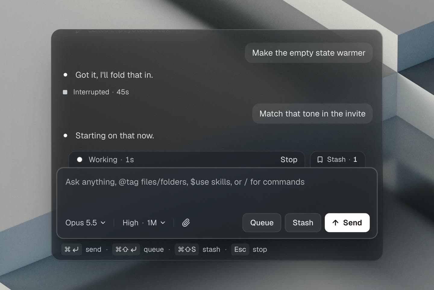
A queued message is not gone and not sent. It is next. So it lands as a full-width chip directly above the composer, and the chip unfolds upward while the text is still in flight. The box you are typing in does not shift a pixel; the chat gives up the space instead. Each chip carries an arrow that sends that message later along the same path as Send, which is how the loop ends.
Stash: put aside, not lost
Stash borrows T3 Code’s idea of tabs peeking out from behind the composer. The message shrinks and slides into a Stash tab at the top right, and the count ticks up. Queue and Stash share a direction, so what separates them is the destination and the scale: one lands as a readable line, the other becomes a number.
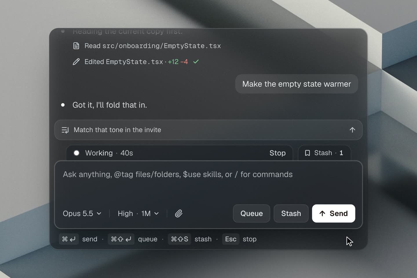
Stop: the turn settles into the transcript
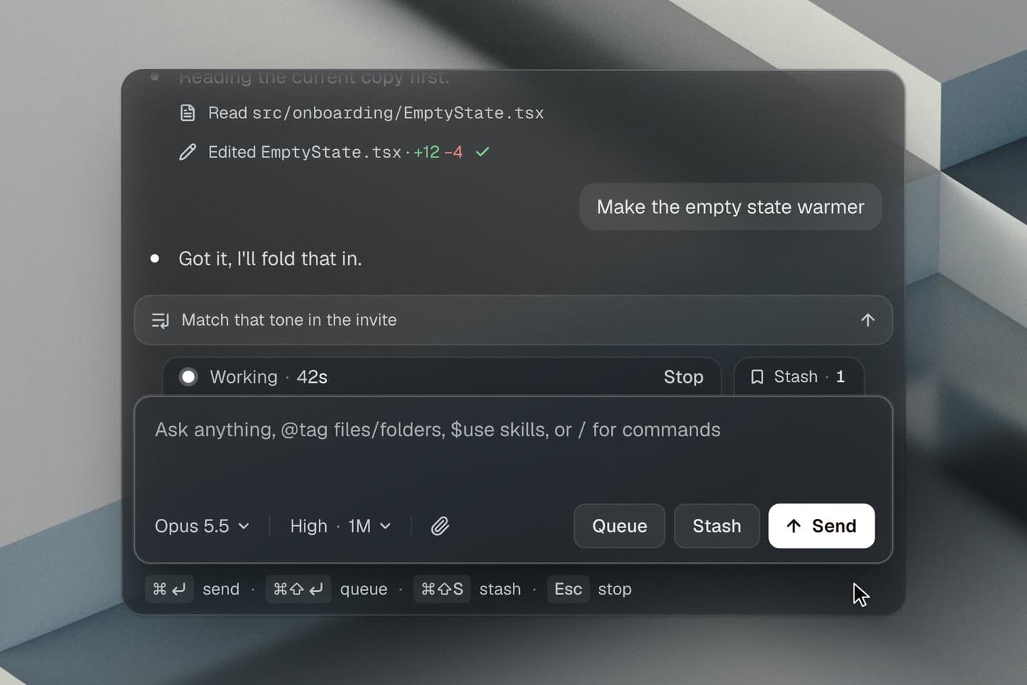
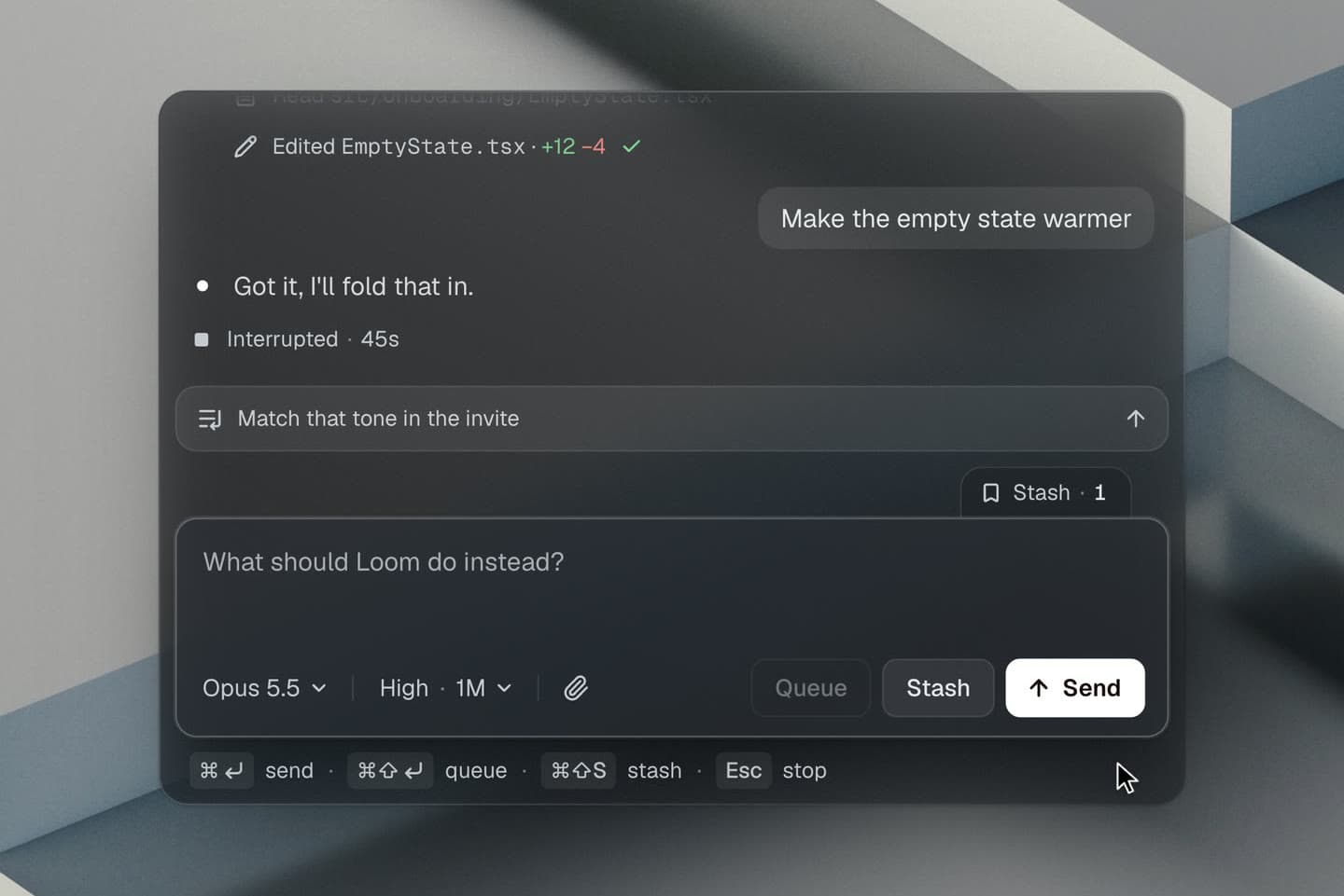
Stop is the one where the message stays and something else moves. The running status, the dot and the timer in the tab above the box, drops into the transcript and becomes the permanent “Interrupted” row, the way Claude Code records an escape. The word swaps halfway down. The halt is instant and the settling is the motion: a firm ease-out, shorter than the other three, no overshoot. Then the empty tab folds back behind the composer.
What I cut
A Steer button, because no real harness has one: sending while the agent works already is steering. A Discard button, for the same reason. A morphing “Sent” pill that collapsed the composer into a slim bar with a check mark; it looked good in isolation and meant nothing, so it went. A slow-motion replay inside the showcase, which made 24 seconds feel like a lecture. And a progressive blur at the top of the chat, which Chrome will not render the way I wanted with masked backdrop filters.
The thing I would defend in a review is not any single curve. It is that you can turn on a “state-driven” switch in the lab and watch all four exits become the same fade. The counts still tick, the rows still appear, and you stop being able to tell what you just did. That is the thesis, felt instead of read.
How it was built
React and CSS keyframes, no animation library. Every path reads its numbers from one table, so the readout under each compare pane, the live exit and the onion-skin ghosts can never disagree. The lab around it has knobs for the axis, the four curves, duration, glass and a compare mode that freezes the real keyframes at exact progress points.
I directed the build and wrote none of the code. Claude Fable 5.1 ran the project: it briefed each round, kept the rules straight between them, and decided what to hand off. Claude Opus 5.5 did the building and the measuring, one agent per round, each one checking landings and timings in a headless browser before reporting back. My job was the part neither of them can do: rejecting what looked impressive and did nothing, and saying what I actually wanted when the first version was close but wrong.